Graham Carter has teamed up with writer Patrick Moody on his new book 'The Grave Diggers Son', creating a stunning Illustrated cover for what sounds like quite a dark but rather intriguing children's book!
An 11-year-old boy must reluctantly embrace his ability to speak to the dead after awakening the inhabitants of the graveyard his ancestors have spent centuries tending.
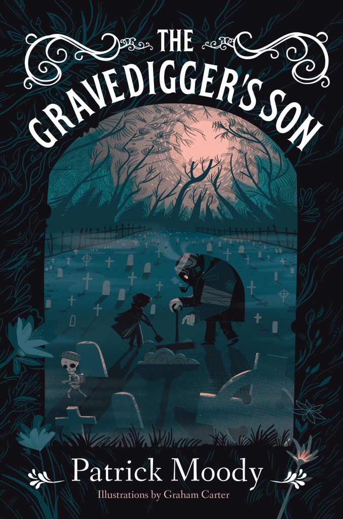
Most people know Graham for his printmaking rather than his commercial artwork, but over the last 15 years Graham has bought to life countless commercial campaigns, editorial pieces and books with his intricate and detailed illustration style. This project is no different as he embraces his dark side to bring to life this cover. It's actually my personal favorite book cover he has done so far!
The book is not released by Skyhorse Publishing until August 2017 so you will have to wait a little longer to snap up your copy!
We had a little chat over breakfast about working on this project, and what's next on the list of things to do for him!
What was the initial brief for this job?
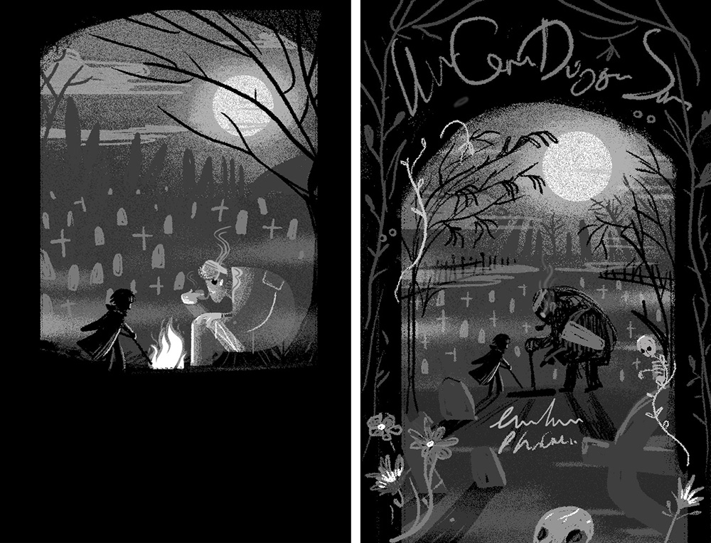
I was given the book text ‘The Grave Digger’s Son’ by Patrick Moody, a story outline and a breakdown of the main characters involved in the story. The brief was to focus on 2 or 3 of the characters, a typical scene (it HAD to be the graveyard really) and create a general ‘mood’ of the book.
Could you talk us through your design process when starting a job like this? How long is the process from roughs to final artwork?
The brief was fairly open despite having to contain the aforementioned elements, so I produced 4 or 5 roughs which had quite a macabre and moody feel about them.
Each rough had a few decorative elements in there because I felt it would counteract some of the gloominess! In some cases the characters were a little more simple and graphic but I think it helped to make them more relatable and illustrative, yet stylised.
I produced the roughs in grayscale on photoshop and the rough stage took about 2-3 weeks I guess. Final artwork was stretched over a month or so (long deadlines are a rare luxury!). Luckily the creatives opted for my preferred rough (again - rare!). The final artwork hasn't veered too far away from the initial rough. I just had to move a few things around to make some space and make it less busy.
Did you find any part of this brief a challenge?
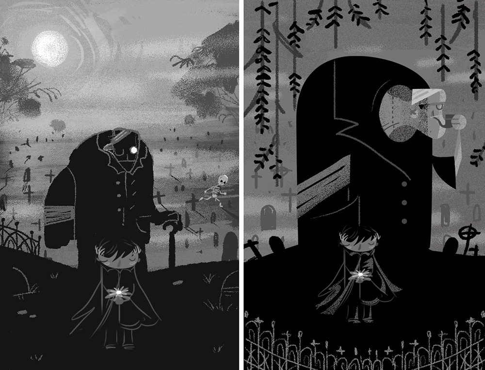
At one point I think I was asked to make it look a little less spooky. The fact it was set in a graveyard at night time with skeletons running around made it a little tricky!
What is your favorite part of this cover & why?
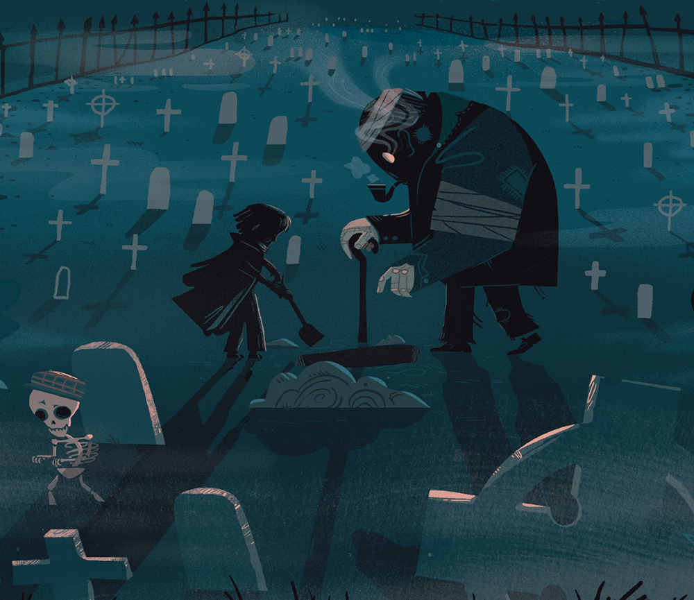
I think overall I'm quite happy with the moodiness of it , with a hint of humour. I think it suits the nature of the story. I’m also happy with the ‘undead’ mentor, tutoring the boy . He is way out of proportion but I felt he should look that way. As if bits of him have decomposed at a different rate or something. I also wanted him to look quite cuddly despite having missing body parts and pipe smoke pouring from his eye socket!
What do you like & dislike about working on commercial projects compared to personal?
Commercial projects by nature can be quite restrictive. Naturally there is a very specific message to get across so it can be limiting creatively . Ultimately though it can be very satisfying if the two come together and everyone on the creative team is on the same page.
Do you have any exciting projects coming up that you can tell us about?
It's the year of my first book release so I'm very excited about that! It's produced by Templar’s Big Picture Press and based on my Alphamals print range I have been working on over the last few years. It's aimed at adults and children alike so keep an eye out!